
Wednesday, August 25, 2010
DOUGLAS HYDE GALLERY, TRINITY COLLEGE, DUBLIN
Barry White gave a talk on American artist Dana Schutz. Her work Tourette's Paintings were on exhibition. White showed the artist's work in the context of art history and the work of her contemporaries such as Damien Hirst and the Chapman brothers focuising on themes of distorted body parts, monsters, and cannibalism. Dana Schutz's work has been described as ‘teetering on the edge of tradition and innovation'. 'My paintings are loosely based on metanarratives. The pictures float in and out of pictorial genres. Still lifes become personified, portraits become events and landscapes become constructions." The exhibition at the Douglas Hyde is a must see. The paintings are technically superb, beautifully painted, brilliant clean clear colours, and the content thought provoking with a black humour edge.


Monday, March 22, 2010
STONES OF BRAY CONT'D

Etching: Chine Colle

Etching: Chine Colle

Etching: Chine Colle
Tuesday, March 16, 2010
WHAT IS CONTEMPORARY ART? by Terry Smith, Univ of Chicago,2009

Monday, March 15, 2010
TAMPA MUSEUM OF ART, FLORIDA HENRI MATISSE:MASTER OF LINE AND LIGHT

Head of a Woman, Mascaron, 1938
Relief, Linoleum

Lift-ground aquatint

All pictures taken from review article by Lennie Bennett, St Petersburg Times, Feb 14, 2010 (Edmund D. Fountain, photos)
Wednesday, February 24, 2010
Stones of Bray cont'd
Two mixed media pieces.
Using torn pieces of The Bray People (local newspaper) to roughly resemble stones, I superimposed intaglio prints of my interpretation of the fossil Oldhamia Radiata which is found in the the foothills of Bray Head. The colours, a mix of oil and liquin,are inspired by the variety of coloured rocks around Bray Head. I also superimposed a few words of text cut from The Bray People. These random words were selected to bring to mind the early markings of language on stones. The first signs of language were etched on stones in the form of symbols or pictures; the stroke marks of Ogham, or the pictorial symbols on henges and standing stones. There are some very ancient stones in the vicinity of Bray (Rathmichael, Stones of Bray p60), bearing cupmarks with circles and radiating lines.
 Oldhamia Petroglyph1
Mixed Media,
8" x 51/2"
 Oldhamia Petroglyph2
Mixed Media
8" x 51/2"
Three Mixed Media
These three pieces follow my now established stone pattern background layer with superimposed text words. Taking note of markings on the face of stones from Naylor's Cove I drew lines in ink. This process I call mapping the stones; the inherent marks on the face of the stones indicating their journey through time and space/place. These stones are the end product of the wearing down of the mountains created by rivers of mud flowing "from a great northern Continent of Archaean Rock century after century."
 Stonejourney1
Mixed Media
8" x 7"
 Stonejourney2
Mixed Media
8" x 6"
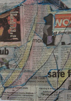 Stonejourney3
Mixed Media
8" x 6"
Using torn pieces of The Bray People (local newspaper) to roughly resemble stones, I superimposed intaglio prints of my interpretation of the fossil Oldhamia Radiata which is found in the the foothills of Bray Head. The colours, a mix of oil and liquin,are inspired by the variety of coloured rocks around Bray Head. I also superimposed a few words of text cut from The Bray People. These random words were selected to bring to mind the early markings of language on stones. The first signs of language were etched on stones in the form of symbols or pictures; the stroke marks of Ogham, or the pictorial symbols on henges and standing stones. There are some very ancient stones in the vicinity of Bray (Rathmichael, Stones of Bray p60), bearing cupmarks with circles and radiating lines.

Mixed Media,
8" x 51/2"

Mixed Media
8" x 51/2"
Three Mixed Media
These three pieces follow my now established stone pattern background layer with superimposed text words. Taking note of markings on the face of stones from Naylor's Cove I drew lines in ink. This process I call mapping the stones; the inherent marks on the face of the stones indicating their journey through time and space/place. These stones are the end product of the wearing down of the mountains created by rivers of mud flowing "from a great northern Continent of Archaean Rock century after century."

Mixed Media
8" x 7"

Mixed Media
8" x 6"

Mixed Media
8" x 6"
Tuesday, February 23, 2010
University of Tampa Scarfone/Hartley Gallery, STUDIO-f 20th Anniversary Exhibition
STUDIO-f is an innovative visiting artist program whose purpose is to introduce national and international artists to the Tampa Bay community by giving students and art enthusiasts an opportunity to meet these artists and to see them working in the studio. This is one of the very few galleries where there is no admission charged. Here are a few pics from the exhibition. I had read about a few of the exhibiting artists and loved the textile prints of Miriam Shapiro and the layered work on mylar of Pedro Perez, I particularly liked his work hanging in the gallery but it was not illustrated in the catalogue. I am fascinated by any work that involves patterning and layering. I have taken a few notes from the catalogue to describe the work shown.
 John Walker
Influenced by his Australian experience, Walker uses the personal icons from paintings for rich lithorgraphic monoprints.
The STUDIO-f monoprints of 1994 exhibit the rich ochre; brown and black layering that creates a luminescent surface with subtle organic forms, vessels with dots of white or black.

Katherine Porter
How abstract imagery acquires meaning has always seemed to fascinate Porter. Her interest in the way an image is framed leads her to a "within and without " field where remnants of geometric shapes create a tension on the plane. Whether in values of Black and white or with rich colour, her pieces speak the language of rhythmn. Monoprints created by Porter in STUDIO-f used elements of portals - shapes and colours overlapping, implying dimension. Some of the STUDIO-f series monoprints are constructed of black, grey , and white flat shapes; others layer monochrome and/or analogous colours to create a rich surface. Some smaller colorful geometric shapes that fill the space balance the geometric shapes.
 Larry Poons
His deep interest in music influences his work by expressing a rhythmn within the context of form. in the 1960's, he created an intriguing form of Systemic painting with optical illusionistic implications. In 1968 he adopted a painterly idiom and returned to gestures of abstract expressionism. Subsequently he moved in the direction of matter painting, heavily textured canvases, with long vertical dragged brushstrokes, densely arranged in rich colour patterns. More recently, Poons has arrived at a more complex style, at once richer and more playful. The STUDIO-f lithographic monoprints Poons created in December 1992 show exciting colour strokes. His high energy is expressed throughout. An illusion of dimension is created by the rhythm of layered colours and shapes vibrate. Poons produced large and small monoprints with exciting variations in colour and design.
 Louisa Chase
Chase's images, building upon Abstract Expressionism, are referential, lushly painted and a bit whimsical. While at STUDIO-f, Chase energetically produced a numbe of outstanding monoprints. Her prints display an interesting balance between logic and emotion. Strong gestural figures and shapes are superimposed over flat, hard-edged, anthropomorphic forms. The linear elements dance through the image while the more geometric elements provide a stabilizing force.
 Miriam Shapiro
A mover and shaker in the feminist art movement that erupted in the 1970's, Shapiro developed her own singular style of femmage, collages using materials like lace, doilies, ribbons and floral fabrics in works that celebrate the traditional domestic handiwork of anonymous women. Shapiro created monoprints in 2004 for STUDIO-f. One of the prints became a series and combines digital prints of a variety of images from her doll collection, collage, and screen printing. These images are arranged in groups in a three story "house" defined with cord and surrounded by a decorative printed border. The Paper Doll Series are six different characters created from original cutouts assembled and digitally printed then embellished with fabric and screen-printed borders.
 Stephen Greene
In 1960 he arrived at his mature style of atmospheeric colour fields punctuated by fluid lines and biomorphic shapes. Greene's work is intellectually symbolic, and reflects his deep reservoir of thoughts and emotions. His highly refined skill in both line and color throughout his career evolved from literal symbolism to make him one of the world's most recognised classic symbolists. The monoprints produced in 1991 at STUDIO-f show Greene at his best - strong symbolism with a skillful use of colours. (this one is for you Yvonne Robinson note the heads)
 Sam Gilliam
Closely associated with color field painting in the '60's and 70's, and the inventor of the subgenre, the draped stained canvas, Gilliam created a secure niche in the history of contemporary art. His work in the '90's has moved to external, internal expression. Gilliam superimposes layers of color while allowing light to radiate from the original surfaces. A high energy is created by moving shapes of opaque and transparent color that explode in a seemingly limitless dimension.In 1993 at STUDIO-f, Gilliam created a series of lithographic monoprints, which he called the Tower Series with intense blues with towers of light-luminous reflections within surfaces. He used explosions of color with raked surfaces creating rich textures. In 1996, Gilliam produced a second series of lithographic monotypes. Layers of surface designs enhanced with hand painting create opulent simulated textures. The Prints are exciting examples of the Gilliam's expertise of integrating shapes and color in the illusion of form in space. In 2007, Gilliam working in screenprint scraped through textures of concrete and sand and many layers of gloss medium, cutting and sewing to assemble the final images. In 2009, Gilliam collaborated with master printer Carl Cowden to create experimental monoprints. He used many new materials including felt, bunting, and concrete to create large monoprints. An illusion of dimension was created by leaving openings, overlapping, cutting apart and reassembling by sewing all the numerous layers together.
 Tom Lieber
Lieber's use of gesture stems from the abstract expressionist tradition exemplified by Jackson Pollock and Franz Kline; yet his subtle colour and tonal variations reveal an affinity to the painterly minimalism of Brice Marden, Lieber's later work represents a more physical and powerful approach. Oftentimes, a single brushstroke or gesture anchors the painting, allowing the underlying colour fields and tonal variations to recede and advance across the ground. In 1993, at STUDIO-f Lieber produced many rich lithographic monoprints. Lieber uses overlapping tangles of lines, looping and exploding in horizontal, vertical and diagonal directions over ground of luminescent colour to create his monoprints. Linear elements applied with skill and spontaneity create limitless space. His work reflects his efforts to channel his interior life onto the canvas in the most intuitive and emotional manner possible.

Influenced by his Australian experience, Walker uses the personal icons from paintings for rich lithorgraphic monoprints.
The STUDIO-f monoprints of 1994 exhibit the rich ochre; brown and black layering that creates a luminescent surface with subtle organic forms, vessels with dots of white or black.

Katherine Porter
How abstract imagery acquires meaning has always seemed to fascinate Porter. Her interest in the way an image is framed leads her to a "within and without " field where remnants of geometric shapes create a tension on the plane. Whether in values of Black and white or with rich colour, her pieces speak the language of rhythmn. Monoprints created by Porter in STUDIO-f used elements of portals - shapes and colours overlapping, implying dimension. Some of the STUDIO-f series monoprints are constructed of black, grey , and white flat shapes; others layer monochrome and/or analogous colours to create a rich surface. Some smaller colorful geometric shapes that fill the space balance the geometric shapes.

His deep interest in music influences his work by expressing a rhythmn within the context of form. in the 1960's, he created an intriguing form of Systemic painting with optical illusionistic implications. In 1968 he adopted a painterly idiom and returned to gestures of abstract expressionism. Subsequently he moved in the direction of matter painting, heavily textured canvases, with long vertical dragged brushstrokes, densely arranged in rich colour patterns. More recently, Poons has arrived at a more complex style, at once richer and more playful. The STUDIO-f lithographic monoprints Poons created in December 1992 show exciting colour strokes. His high energy is expressed throughout. An illusion of dimension is created by the rhythm of layered colours and shapes vibrate. Poons produced large and small monoprints with exciting variations in colour and design.

Chase's images, building upon Abstract Expressionism, are referential, lushly painted and a bit whimsical. While at STUDIO-f, Chase energetically produced a numbe of outstanding monoprints. Her prints display an interesting balance between logic and emotion. Strong gestural figures and shapes are superimposed over flat, hard-edged, anthropomorphic forms. The linear elements dance through the image while the more geometric elements provide a stabilizing force.

A mover and shaker in the feminist art movement that erupted in the 1970's, Shapiro developed her own singular style of femmage, collages using materials like lace, doilies, ribbons and floral fabrics in works that celebrate the traditional domestic handiwork of anonymous women. Shapiro created monoprints in 2004 for STUDIO-f. One of the prints became a series and combines digital prints of a variety of images from her doll collection, collage, and screen printing. These images are arranged in groups in a three story "house" defined with cord and surrounded by a decorative printed border. The Paper Doll Series are six different characters created from original cutouts assembled and digitally printed then embellished with fabric and screen-printed borders.

In 1960 he arrived at his mature style of atmospheeric colour fields punctuated by fluid lines and biomorphic shapes. Greene's work is intellectually symbolic, and reflects his deep reservoir of thoughts and emotions. His highly refined skill in both line and color throughout his career evolved from literal symbolism to make him one of the world's most recognised classic symbolists. The monoprints produced in 1991 at STUDIO-f show Greene at his best - strong symbolism with a skillful use of colours. (this one is for you Yvonne Robinson note the heads)

Closely associated with color field painting in the '60's and 70's, and the inventor of the subgenre, the draped stained canvas, Gilliam created a secure niche in the history of contemporary art. His work in the '90's has moved to external, internal expression. Gilliam superimposes layers of color while allowing light to radiate from the original surfaces. A high energy is created by moving shapes of opaque and transparent color that explode in a seemingly limitless dimension.In 1993 at STUDIO-f, Gilliam created a series of lithographic monoprints, which he called the Tower Series with intense blues with towers of light-luminous reflections within surfaces. He used explosions of color with raked surfaces creating rich textures. In 1996, Gilliam produced a second series of lithographic monotypes. Layers of surface designs enhanced with hand painting create opulent simulated textures. The Prints are exciting examples of the Gilliam's expertise of integrating shapes and color in the illusion of form in space. In 2007, Gilliam working in screenprint scraped through textures of concrete and sand and many layers of gloss medium, cutting and sewing to assemble the final images. In 2009, Gilliam collaborated with master printer Carl Cowden to create experimental monoprints. He used many new materials including felt, bunting, and concrete to create large monoprints. An illusion of dimension was created by leaving openings, overlapping, cutting apart and reassembling by sewing all the numerous layers together.

Lieber's use of gesture stems from the abstract expressionist tradition exemplified by Jackson Pollock and Franz Kline; yet his subtle colour and tonal variations reveal an affinity to the painterly minimalism of Brice Marden, Lieber's later work represents a more physical and powerful approach. Oftentimes, a single brushstroke or gesture anchors the painting, allowing the underlying colour fields and tonal variations to recede and advance across the ground. In 1993, at STUDIO-f Lieber produced many rich lithographic monoprints. Lieber uses overlapping tangles of lines, looping and exploding in horizontal, vertical and diagonal directions over ground of luminescent colour to create his monoprints. Linear elements applied with skill and spontaneity create limitless space. His work reflects his efforts to channel his interior life onto the canvas in the most intuitive and emotional manner possible.
Subscribe to:
Posts (Atom)